Graphic Design
EQUINOR
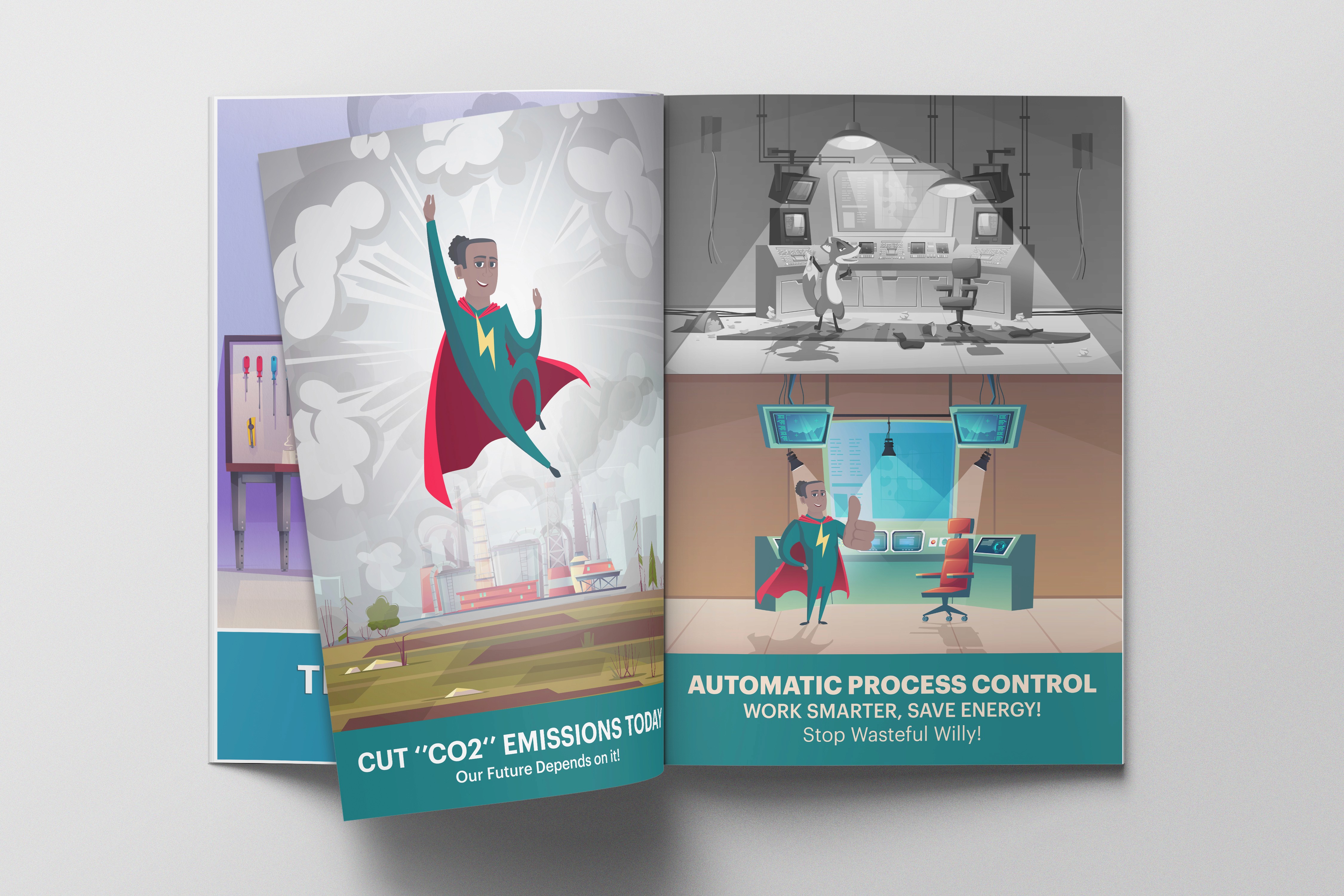
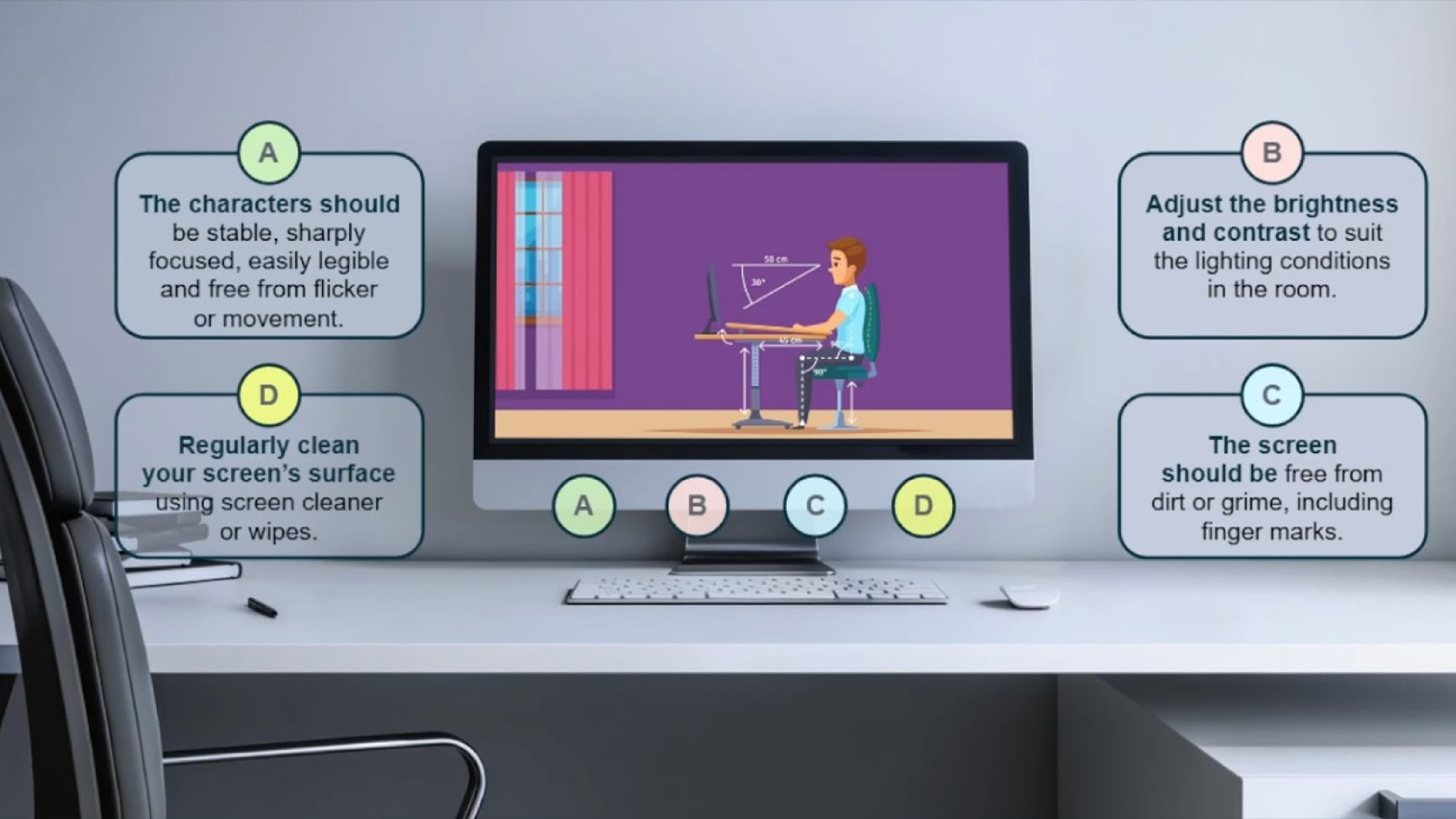
This project was developed around the idea of creating a visual communication system for Equinor, focused on everyday workplace safety, awareness, and responsible behaviour. I created a series of instructional and playful posters addressing topics such as safety, emissions, electricity, environmental responsibility, workplace behaviour, and ethics. The intention was to make important messages more visible, memorable, and engaging in everyday work environments.
Year :
2024
Industry :
Energy Sector
Client :
Equinor
Project Duration :
4 weeks

Problem :
Safety and workplace guidelines are often communicated through formal instructions, warnings, and large amounts of text, which can become easy to overlook in a busy working environment. The challenge was to communicate serious topics without making the materials feel overly corporate, repetitive, or intimidating. The posters needed to capture attention quickly while making the message immediately understandable.
Solution :
I developed a series of branded visual concepts that combined clear instructional messaging with playful illustrations and relatable everyday situations. Each poster focused on a specific problem or behaviour, using visual storytelling to communicate the message at a glance. The concepts were designed to work as a unified campaign while giving each individual topic its own visual identity and personality.


Challenge :
The main challenge was finding the right balance between playfulness and seriousness. Topics such as safety, environmental impact, electricity, and work ethics require clear communication, but the visuals also needed to be approachable enough to encourage people to actually engage with them. Maintaining Equinor's professional brand identity while introducing a more creative and human visual language was an important part of the process.
Summary :
The result was a collection of instructional safety and awareness posters designed to communicate important workplace messages in a more engaging way. By combining branding, illustration, humour, and visual storytelling, the project demonstrates how serious information can be made more memorable without losing its importance. The concept could also be developed into a wider visual communication system covering different departments, locations, and workplace scenarios.

More Projects


Graphic Design
EQUINOR
This project was developed around the idea of creating a visual communication system for Equinor, focused on everyday workplace safety, awareness, and responsible behaviour. I created a series of instructional and playful posters addressing topics such as safety, emissions, electricity, environmental responsibility, workplace behaviour, and ethics. The intention was to make important messages more visible, memorable, and engaging in everyday work environments.
Year :
2024
Industry :
Energy Sector
Client :
Equinor
Project Duration :
4 weeks
Problem :
Safety and workplace guidelines are often communicated through formal instructions, warnings, and large amounts of text, which can become easy to overlook in a busy working environment. The challenge was to communicate serious topics without making the materials feel overly corporate, repetitive, or intimidating. The posters needed to capture attention quickly while making the message immediately understandable.
Solution :
I developed a series of branded visual concepts that combined clear instructional messaging with playful illustrations and relatable everyday situations. Each poster focused on a specific problem or behaviour, using visual storytelling to communicate the message at a glance. The concepts were designed to work as a unified campaign while giving each individual topic its own visual identity and personality.
Challenge :
The main challenge was finding the right balance between playfulness and seriousness. Topics such as safety, environmental impact, electricity, and work ethics require clear communication, but the visuals also needed to be approachable enough to encourage people to actually engage with them. Maintaining Equinor's professional brand identity while introducing a more creative and human visual language was an important part of the process.
Summary :
The result was a collection of instructional safety and awareness posters designed to communicate important workplace messages in a more engaging way. By combining branding, illustration, humour, and visual storytelling, the project demonstrates how serious information can be made more memorable without losing its importance. The concept could also be developed into a wider visual communication system covering different departments, locations, and workplace scenarios.
More Projects
Graphic Design
EQUINOR
This project was developed around the idea of creating a visual communication system for Equinor, focused on everyday workplace safety, awareness, and responsible behaviour. I created a series of instructional and playful posters addressing topics such as safety, emissions, electricity, environmental responsibility, workplace behaviour, and ethics. The intention was to make important messages more visible, memorable, and engaging in everyday work environments.
Year :
2024
Industry :
Energy Sector
Client :
Equinor
Project Duration :
4 weeks
Problem :
Safety and workplace guidelines are often communicated through formal instructions, warnings, and large amounts of text, which can become easy to overlook in a busy working environment. The challenge was to communicate serious topics without making the materials feel overly corporate, repetitive, or intimidating. The posters needed to capture attention quickly while making the message immediately understandable.
Solution :
I developed a series of branded visual concepts that combined clear instructional messaging with playful illustrations and relatable everyday situations. Each poster focused on a specific problem or behaviour, using visual storytelling to communicate the message at a glance. The concepts were designed to work as a unified campaign while giving each individual topic its own visual identity and personality.
Challenge :
The main challenge was finding the right balance between playfulness and seriousness. Topics such as safety, environmental impact, electricity, and work ethics require clear communication, but the visuals also needed to be approachable enough to encourage people to actually engage with them. Maintaining Equinor's professional brand identity while introducing a more creative and human visual language was an important part of the process.
Summary :
The result was a collection of instructional safety and awareness posters designed to communicate important workplace messages in a more engaging way. By combining branding, illustration, humour, and visual storytelling, the project demonstrates how serious information can be made more memorable without losing its importance. The concept could also be developed into a wider visual communication system covering different departments, locations, and workplace scenarios.